A lackluster dealership website is a major drag. We don’t know of any dealership that’s content to miss out on sales (particularly when they know they could be winning those sales) — but that’s exactly what happens when a site doesn’t meet their shoppers’ needs.
As devoted congregants in the church of customer experience, we’re as bothered by poor performing websites as you are — so we’ve put together eight of the best tips we have for optimizing your dealership website. We hope they serve you well.
Dealership Website Optimization Tip #1: Keep Navigation Consistent
Website navigation isn’t exactly exciting. At least, most people don’t consider it in the top ten thrills of life. We might not be able to make website navigation into the online equivalent of skydiving, but we’ll certainly start off by dispelling the notion that because navigation isn’t exciting, it doesn’t matter.
It does. Here’s just how much:

So navigation might not be the most dazzling aspect of dealership website design, but it is the most important. Better yet, navigation it can be optimized on your dealership website to provide a better all around experience and website performance. Here’s how:
When it comes to improving your site functionality, ensuring consistent navigation is one of the best steps you can take. That might sound a little vague though. Consistency itself is a pretty large term — it can stretch to fit pretty much your entire dealership experiences. But when it comes to consistency and navigation, there are two essential elements:
#1: Always make it incredibly easy to find what the shoppers are looking for.
#2: Conform to (or better yet, exceed) shopper expectations and industry standards.
The first of these navigation tenants is deceptively simple. Making it easy for shoppers to find what they are looking for means consistent navigational links on each page, intuitive design that speaks to shopper needs, and, somewhat less obviously, multiple options for navigation.
Multiple options? Yes. Navigation needs to work for all your shoppers, including people who already know what they are looking for, people who are independently browsing, and people who need help to find what they want. People who already know what they want will jump for things like a search bar, while those who are just browsing might go for sorting options or filters. Your website navigation should cater to the needs of everyone who shows up on your site.
The second of these tenants — which calls for conformity (within reason) to shopper expectations — is slightly easier. This involves making sure that your navigational elements fall within the parameters of expectation — meaning that they match up as closely as possible with what shoppers expect and desire.
What does this actually look like?
![]()
A free-text search bar.

Jellybeans that show your most popular models laid our for easy selection.
 A homepage search module that lets shoppers search however they want to.
With all three right on a dealer’s main homepage, I can locate whatever vehicle I’m looking for using the free-text search, sorting and searching module, or by clicking on the model types showcased below.
Optimizing your navigation starts with an experience audit. Involve others in this. Don’t assume that because you know how to use your site that your shoppers have the same experience. During this audit, explore other sites — both your direct competition, and any popular or creative ecommerce sites. Next, use the information you gathered in your audit to identify problem areas. Finally, start fixing and improving these problem areas — or get in contact with your website provider.
When it comes to crafting an awesome dealership experience online, navigation is central to seeing success, but so are many other things. Let’s optimize those too. Next up: personality.
Dealership Website Optimization Tip #2: Put Your Personality Forward
For many car dealers, personality is something that happens in person. It comes across in your friendly salespeople, your dedicated service technicians, your hardworking admin staff, and naturally, your unshakable GM. Often, that dealership personality is what wins over a wavering shopper, right? That’s all true, but the car shopper journey starts online — and so that’s where dealership personality most needs to shine.
To help illustrate this point, here’s a true dealership website horror story:
A friend of mine was recently shopping for a new car. He’d narrowed their search to a specific make and model, and were looking for local dealerships. During this typical stage of the car-buying process, he found two totally unrelated dealerships that had nearly identical websites.
I’m not kidding. These sites were almost exactly the same, from the generic images used for their homepages, to the website font, even down to the website copy itself. Naturally, my friend didn’t end up purchasing from either.
Here’s the point of that story:
Sure, if my friend hadn’t looked at the other dealership, he wouldn’t have made the ridiculous discovery and would have assumed that website was the only one. But he did look at that other dealership — and so will other shoppers. On top of all that, here’s the really chilling problem: If a site can be so easily copy and pasted to another dealership, it means that the website says next to nothing about the dealership it represents. Not good at all.
So, to start optimizing for yourself, determine the specific characteristics of your dealership personality and important themes of your mission statement. Once you have these essential characteristics selected, evaluate how well you can represent these characteristics, and what elements and areas of your website can be most easily edited to display those traits. Consider your dealership homepage, branding, logo, copy, and dealership-specific website content — or take inspiration from dealers like Galpin and Rochester Toyota.
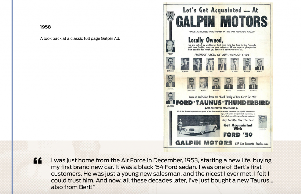
We all know that Galpin WINS when it comes to personality (and Ford sales). Their gorgeous About Us page demonstrates this perfectly, complete with a timeline of the Galpin story.

Pictured: A snippet from the Galpin story.
And can we talk about that incredible review from a 1953 customer? A home run. Galpin’s dealership personality comes across in everything they do, but their About Us page is a particularly stellar way to communicate Galpin’s unique dealership personality online.
Another champion: Rochester Toyota. These delightful dealers are undoubtedly dog-friendly. Their family of adorable Golden Retrievers are heavily featured across their online presence.
 Featured here: A very good dog from the Hours and Directions snippet on the homepage.
The only way this could be a disappointment is if you went in and the dogs weren’t there that day. Really though, all cuteness aside, a dog-friendly (rather, dog-loving) dealership personality communicates a business that is a friendly, dedicated, and relatively down-to-earth (they clearly don’t take themselves too seriously). Who doesn’t want to shop at a place like that?
Now let’s transition from sentiment and personality to something a little more tangible (though only a little) — optimizing the online start to the sale.
Dealership Website Optimization Tip #3: Enable a Smooth Start to the Sale
The online car shopping experience is shifting online — and with good reason. The average dealership sales process is a lengthy affair involving no small amount of paperwork — not to mention waiting.
This optimization focuses on what you can do for shoppers who have found a solution they want to explore more fully. So what can you do on your dealership website to enable a smoother, more modern, more effective start to the sales process?
First up, offer payment calculators. These helpful little tools make it easy for shoppers that want to explore their financial options.
Next, move more of your sales process online. It’s not uncommon for a car shopper to handle almost everything over the phone, but it’s hardly the industry standard. Change that. Give shoppers the option to fill out paperwork and complete tedious and time-consuming tasks from the comfort and convenience of their own home. If you make that option available, consider what you can do to facilitate this with your website. Add snippets on your homepage that inform shoppers of this service, feature the program in a banner image on your site, or showcase this initiative in its own web page.
You can also optimize your forms by cutting down on steps and form fields. Only requiring one step to schedule a service appointment or request more info about a vehicle means that shoppers are less likely to bounce or experience a “reconsideration” moment.
As a final optimization tip, make it possible for shoppers to save vehicles they are interested in without having to sign in to your site. As we know from our forms, people don’t like to give up info unless they absolutely have to, and forcing them to do so may discourage them from using that service or option.

Dealership Website Optimization Tip #4: Bring the Visual Power
Humans are visual creatures — we take in and process enormous amounts of visual data every day. We rely on it. Research shows that people decide whether to buy a product within 90 seconds, and on top of that, visuals are the top influencer in purchasing decisions.
Now, people shop for (and buy) cars differently than other products. We don’t know anyone who has made a decision to buy a car 90 seconds after seeing a picture of it. However, that doesn’t make visual less impactful. A shopper will likely still have that “Oh, awesome! I want it!” moment while looking at online images of the car (you just have to wait longer than 90 seconds to see their wallet).
Images and video can bring your Vehicle Detail Pages to life — but really, and we can’t stress this enough, not just and photos and video. Technically, any photos of the car will work, but we’re talking optimization, not just what will technically work.
Optimize visuals on your dealership website by increasing image quality, replacing stock images with shots of that specific vehicle, and providing all the photos you can.
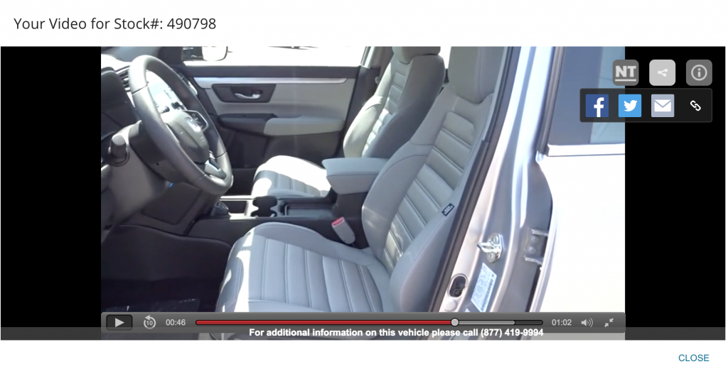
Another exceptional visual element to add to your site are walk-through videos. Ecommerce functions so well so for a variety of reasons, and one way it triumphs is by providing more information about a product than could be gathered in-store. Walkthroughs are an excellent embodiment of that increased access to information.
 A good walk-through takes the shopper inside the car — letting them explore the vehicle in the closest to a real dealership visit that they can get.
Dealership Website Optimization Tip #5: Strengthening the Social Media-Website Relationship
An awesome website with little traffic doesn’t have a ton of opportunity to prove how good it is. Boost your traffic, CX, and overall engagement by paying careful attention to the interaction between your social media and your dealership website.
First up, involve your social media on your site. Naturally, there are a variety of ways to do this:

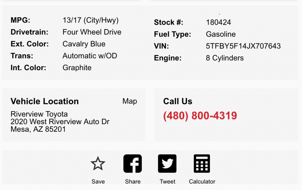
A hello bar can contain pretty much anything you want it to, and makes an excellent place for social media buttons. Link these to your most prominent and popular social media profiles. You can also host your social buttons on your VDPs, making it a breeze for shoppers to share cars with their family, friends, followers, or a car-shopping partner.
 If you remember the video walkthroughs example from last section, you might have noticed the social share option in the video walkthroughs. That’s another excellent way to help shoppers share the vehicle they are considering with others.

You can also add social buttons to a design element at the bottom of your web pages, showing shoppers who scroll all the way down where they can check for more dealership information and updates.

Now, social media works both ways. You can capitalize on your newly optimized dealership website by showcasing this improved experience on social media. Frequently link to your site and show social shoppers the value you have to offer. Link to new vehicles and hot inventory, or awesome specials. You can also take this opportunity to disseminate information about exciting new additions to your website, like fresh testimonial videos or new blog posts.
Dealership Website Optimization Tip #6: Offer a Uniquely Relevant Online Experience
Your website should function as an online extension of your dealership — representing your inventory, staff, and personality exactly how they are on the lot (if not slightly better). But if someone walked into your dealership and asked about trucks, you wouldn’t take them over to your hottest sedans.
As ridiculous as that seems, when it comes to online car shopping, that’s the standard experience. Though sites like Amazon come up with brilliant personal product recommendations, relevant and unique experiences aren’t available on many dealership websites.
Optimizing your site for a more personalized experience starts with incorporating new website technology that can alter what shoppers on your site see based on what they’re interested in.
We offer Behavior-Based-Targeting, built-in dealership website software that changes content based on the user’s interests. This website tech learns from shopper behavior on your site (including which landing page they arrive at) and adapts special content on your SRPs and homepage to reflect deals that might interest them.
For example, a shopper who indicated an interest in F-150’s would see the following content in the SRP:
 It might seem like a large change for optimization, but a more relevant customer experience pays off. 56% of customers are more likely to shop at a business that offers a good personalized customer experience — like the kind delivered by BBT.

