Filters are fiddly. There’s no arguing that when it comes to filter design, there is a lot that can go wrong. How many options? How should they be displayed? Icons or no? These vary from dealership to dealership,
But regardless of how carefully they’re tweaked and tuned, many filters are fundamentally lacking. Here’s exactly how (don’t panic too much if this feels familiar):
Dealership Website Problem #7: Infuriating Filters
Imagine the following scenario:
You’re looking for a car.
You’re 79 results deep on a dealership website.
You’ve seen a lot of cars that more or less fit what you want, and you’re excited to look further, so you decide to filter down the results.
Now imagine you have to scroll all the way to the top of the page to use the filter.
If that sounds frustrating, you’re right. And even though that situation is so clearly annoying, that frustration is also the norm. Clunky, chunky, poorly-thought-out filters are a dime a dozen. These flimsy filters tank your customer satisfaction and the efficacy of your site.
How To Solve It:
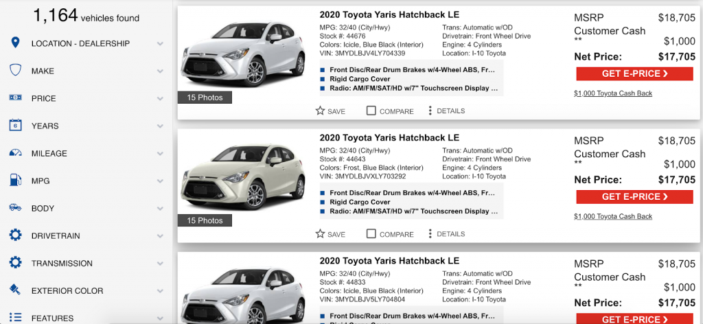
Here’s how we solve this particular problem: Sticky filters. Rather than being banished to the top of the page, our filters stick with the shopper, always ready to be used – and acting as a helpful inventory of what’s on offer.
Essentially, instead of sticking to the top of the page and making users scroll down to see the results, our page stays in one place, and the results scroll.
Pictured: Filters that stick with you no matter how far you scroll.

Conclusion:
With filters like ours that move with the results, there’s no wasted time or energy on navigating the site itself – users just get to do what they came for – find the right car.
Sometimes, the solutions don’t involve a website overhaul or a fundamental rethinking of your online sales strategy – it’s just small, simple fixes that make a website better all around. Implementing changes like these can mean the competitive advantage in your area.

